Spivi
Case Study by Hannah Rosentreter
Information Architecture | User Interface Design
Select a seat with ease and transparency on Spivi
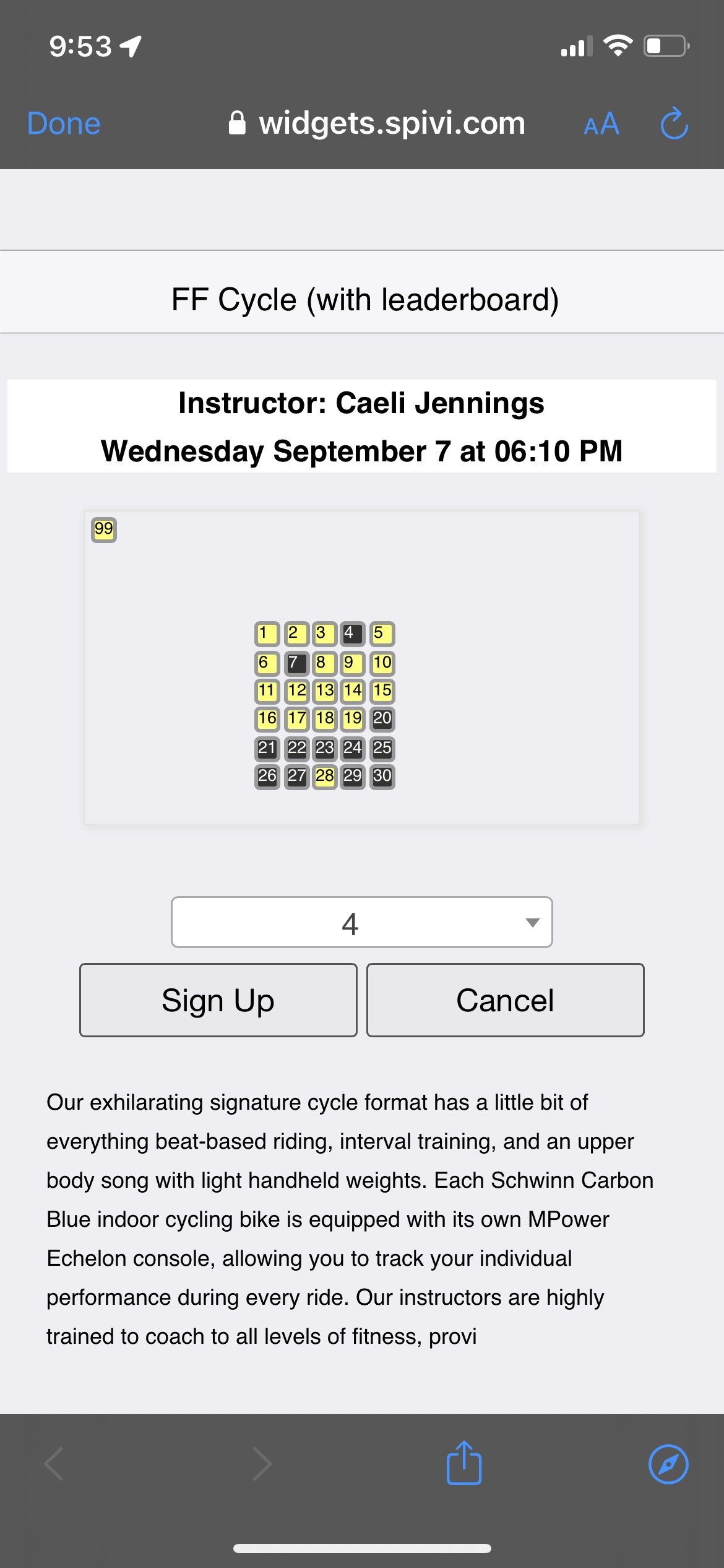
Spivi enables exercisers to select their seat in a workout class in advance of showing up. The UI for this platform felt outdated and confusing when I used it for a recent cycling class, so I decided to take it for a spin.
Project Overview
Information Architecture
Evaluation
Wireframe
Interaction Design
User Interface Design
Style guide development
Application of style guide to wireframes
Typography
Iconography
My Process
Evaluate the current product to identify the needs and pain points at the root of the difficult user experience.
Pain Points:
Everything is so small. The seat numbers, the text description, the margins between elements that require user selection.
Unclear which seats are available vs. taken
Unclear where each seat is in relation to the orientation of the room
Unclear call to actions. I am able to infer based on the page I navigated from that I am meant to be selecting a seat in class, but this page doesn’t make it clear that is what is happening. Also, what happens if I press cancel? Does my class get cancelled?
Goals:
My goal as a user is to book a seat in a class I already have reserved.
I don’t need to learn about all the details of this class during this stage in my journey.
I want to know where I can expect to go when I enter the class space.
I want to know that I am selecting a seat in the correct class and time.
Wireframe a new concept
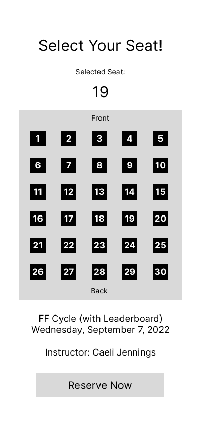
Where I’ve changed things based on my evaluation:
Call to action is clear - “Select Your Seat”
Added “Front” and “Back” to signify where in class the seat is.
The seat icons and classroom map are significantly larger, making them easier to tap to select. This does away with the drop-down select that clutters the page and disconnects the user’s attention from where the seat is in the room.
Removed unnecessary text content to create more room on the page.
Gave one button option of “Reserve Now” to signify that the user is meant to confirm their choice once they select their seat.
Kept the class title, date and instructor information. However, I moved it closer to the “Reserve Now” button to follow a better information hierarchy, signifying that the class details are a review detail, rather than a headline detail.
Apply new UI that emphasizes choices
Upgraded UI features:
Colors that signify status
Bright accent color signifies seat in the classroom map that is currently selected. This is reiterated in the “Selected Seat” section, and on the call to action to “Reserve Now”. All of this is in an effort to emphasize that "If I tap the Reserve Now Button, I will be selecting seat 19.”
Translucent, strike-through numbered seats signify to the user that the seat is taken and not available to be reserved
Dark green seats signify availability with their clearly visible seat number. These seats are able to be interacted with if the user taps on them
Dimension is added through application of drop shadows and inner shadows
Font size is larger and clear contrast is applied to adhere to WCAG 2.1 standards


